Saturday, February 27, 2010

Desktop publishing basics

Putting out an appealing newsletter, brochure or other print publication for your church is often not simple or easy.  Most people need some level of training on how to do it well.

Your information needs to be in an easy-to-read, eye-catching format. Good publication design delivers news and messages effectively. Take the time to understand and follow simple fundamentals of design. The end result will be a publication that is easy to quickly understand and easy on the eyes.

Layout basics

It may be fun to use the variety of colors, graphics and fonts offered with many design tools, but remember tha readability is the most important aspect of your piece. Due to the web, more people now "scan" even written text rather trhan read it.  So we need to adopt new techniques to help people find what they want and read it easily.

Easy-to-read pubs use

  • A serif font for text and a sans serif font for headlines and subheads. Serif fonts have extra strokes at the end of the lines that form the letters; sans serif fonts have no extra strokes.
  • A type size of 11 points or larger.
  • Left-aligned margins, not justified.
  • Text in columns and boxes -- not spread wide across a page.
  • Grouping of related stories on a page.
  • Graphics or photos that visually describe the story and draw interest. It's OK to use up to three fonts in your publication — one for text, one for headlines and one for your banner or nameplate. But suing more than three can cause clutter and look "circusy".

Headlines

Headlines (and even subheads) need to quickly tell tyhe reader what the text is about.  Avoid "cute" headlines or ones that allude to the text but don't rteally describe what's important. Articles at the top of a page normally should be larger than those lower on the page. Size and placement relates to importance.

White space

White space — the space not occupied by text or graphics — makes the page easier to read. Don't avoid it -- treat is as your friend. Cramming a page full makes it look like a tough read.  Some people avoiud tough reads. Use white space on all four margins, between columns and within text itself.

Simplify text

A rule of thumb when writing for the web is to try to delete 50% or more of the existing text. After boiling down the text to the essentials, look for "lists" of things and change them to bullets. Then break up the longer articles with subheads.
[reference: Technology for Ministry, UMCom]

Monday, February 22, 2010

New, smaller PDF Reader

Adobe products, even the free Adobe Reader, are getting attacked pretty heavily these days and experts say it's likely to continue. The security patches are coming out much too frequently for my piece of mind. So what's a great solution if your church needs a free PDF reader? Nuance PDF Reader.

Nuance now offers the free PDF Reader. It's much smaller, fast, and full of features. I have been waiting for this to come out, as my favorite PDF editing software is from Nuance also -- PDF Converter Professional. I've been testing PDF Reader ever since it was announced a few days ago. Last night I removed Adobe Reader from my computer.

Keep your church office and personal computer safer -- remove Adobe Reader and use Nuance PDF Reader instead.

PDF Converter Professional -- Acrobat replacement
Nuance was originally called ScanSoft. They are well-known for the industry-leading OminPage OCR software and for the PaperPort software  that comes with some scanners. They also produce the Dragon NaturallySpeaking speech recognition software. I first learned about Nuance when researching a replacement for Adobe Acrobat for work. I am very enthusiastic about the quality and features of Nuance PDF Converter Professional. Their conversion from PDF back to an Office type file such as MS Word, is exceptionally good.

I recommend replacing Adobe Acrobat if not for the security considerations as well as pricing. My replacement is PDF Converter Professional from Nuance.

The Nuance folks tell me that Microsoft hired them to provide the file-to-PDF converter for Microsoft Office ... you may notice a "printer" called "DocuCom" or "DocuCom PDF driver" -- that's done by Nuance.  Out of that PDF Converter program grew PDF Converter Professional, a full-blown, powerful PDF editor as well as converter.

PDF Converter Professional is much less expensive that Adobe Acrobat and has the features that businesses and churches need. Why pay the outrageous amount Adobe asks for Acrobat? Even with a church discount through the UMC TechShop, Acrobat is twice as expensive as PDF Converter Professional.

Saturday, February 20, 2010

Making websites that are evangelistic

Websites offer us incredible power to share the Good News. But to make use of this potential, we must understand
these six issues:
  • The nature of the Internet -- It is a pull medium.
    • There is no automatic audience for any website.
    • There are only three ways that someone will find a site:
      • using a search engine
      • following a link from another website
      • by a personal recommendation – in an email, on a contact card, in print, TV/radio etc.
    Read more ...

Wednesday, January 20, 2010

Selecting a web hosting service

Web Designs From Scratch has a near-realtime comparisons of hosting services' uptime and support.

This could prove quite helpful in selecting a web host.

While checking out web hosting companies recently, I noticed that it pays to carefully compare options by any one company. In one case, a Linux server hosting would get you a free blog or two compared to the Windows server option. But then you lost a feature or two that got offered with Windows hosting.

Also, make sure you check on whether web statistics come with a package or not.  You'll want the stats to help you learn where you are effective, what people are searching for, and more.

Sunday, January 03, 2010

Church web site templates

Finding really good web page templates for your church can be frustrating. You want one that is strict XHMTL 4.01, pure CSS -- no use of tables for layout, one that is attractive, yet a look that accurately reflects your congregation.

Depending on your web hosting service, you may not be able to change the menu links area other than to specify the name and URL for the existing "buttons" or links.  Make sure to check out all aspects of any website building software offered by a web host.

Using stock photos may add eye appeal but actually be misleading. Here are a few of the templates I've been checking out when looking for a possible new, reasonably priced web hosting solution.

Tuesday, December 15, 2009

Church web site design change

Avondale Pattillo United Methodist Church recently updated the design of its web pages. Some of their decision-making process may help other churches.

Why a design change?
  • Inconsistent design across all 140 pages on their web site.
  • Inconsistent use of sidebar content.
  • Inconsistent color scheme across all pages.
  • A desire to use less clip art and more photos on pages.
  • The HTML code contained elements that were on the list to be outdated (deprecated) by the World Wide Web Consortium.
  • A desire to keep the whole home page content visible on a 1024x768 pixel resolution screen.
APUMC made many changes in order to give a consistent, "professional" appearance, help navigation, and speed findign information:
  • Adopted one design for all web pages, with two exceptions:
    • Pages that were part of a prior years' training sessions. (That whole training section may be revised or even eliminated later).
    • "Resources for United Methodist Leaders" pages.  These had a different look deliberately and are aimed at a different audience from most of the site.
  • Placed "utility" links at the top right, above their header.
    • Used the specific "APUMC" instead of the common but generic "Home" as the link to their home page.
    • Used the clearly understandable "A-Z Index" instead of the more geeky "SiteMap".
  • Placed the search box to the right right above the header.
  • Placed links to their main sections (Calendar, Ministries, Resources, Services, and Visit Us) in a horizontal bar just under the header and used unique hover colors for these links.
  • Placed sub-section menus (in Ministries, for example) to the left of the central content and used unique hover colors for these links.
  • Used a standard footer that included:
    • Church name, address, and church office phone number.
    • "This page was last updated: "
    • "Contact Us" link
    • "Notice & Privacy Policy" link
    • "Share this page" (using AddThis.com) link area
  • Used standard formatting for varied HTML elements, via an updated Cascading Style Sheet.
  • Used two "QuickLinks" boxes on the home page ... one with links for visitors and one for members.
  • Added photos on most "special section" pages for Lent through Easter and for Advent through Epiphany.

Saturday, November 21, 2009

More web empowering of the church

More bullets of points made by Mark Stephenson (Ginghamsburg Church) in his online video

Empowering sermons

  • Video
  • Audio

Empowering discipleship

  • E-learning
    • Teaching the staff
    • Bible Study
    • Sunday School
  • WEC Flash allows video plus slides

Empowering connection

  • Blogs (pastor, youth leaders ... "All youth leaders should think about having a blog", ...)

Devotions, Journaling

  • Daily scripture
  • Devotional or study
  • EMail option

Sunday, November 15, 2009

Web Empowering Your Church

Mark Stephenson at Ginghamsburg Church, Tipp City, OH, gives an online Video and synchronized slide presentation, "Web-Empowering the Church".

It's quite good, but plan on spending time -- it's over an hour of streaming video.

Thursday, October 01, 2009

Church website beauty

Church Beauty is the Church web site equivalent of CSS Beauty.

Most of the designs are very heavy on graphics and have a "slick" look. Many of the included webs seem to have a home page that's less functional that I'd like to see for visitors and members alike. A few have some uniquer approaches to presenting information that are worth considering. But remember that Church Beauty is about the look, not the content.

Personally, slick looks make me nervous and I cringe at the jarring, over-saturated colors of some church webs -- they have an "circus" atmosphere. I prefer a "good" look with outstanding content over a flashy look with mediocre content.

Thursday, September 10, 2009

The Web-Empowered Church

I pulled some key points from the online video by Mark Stephenson about the Web Empowered Church (WEC) ...

The big 3 pluses of WEC

  • Automate ministry processes.
  • Store information for easy, immediate access.
  • Connect with people anytime from anywhere in the world.

WEC Goals: expand, increase, extend

  • Expand evangelism, discipleship, and care.
  • Increase ministry efficiency and effectiveness.
  • Extend ministry beyond the church walls.

Other points, tips, and ideas

  • Web be more cost-effective communication than nearly any other media type. You can fund a web site for a year for the cost of a few mailings from the church.
  • You can start with volunteers. The first 1,000 pages at the Ginghamsburg site were done by unpaid servants. The site is now at 4,000 pages, including several years' of text and video of sermons.
  • You can minister to people worldwide 24 hours a day.
  • You can get the word out immediately.
  • Easy 24 x7 member participation (emails; online discussions -- IM, chat, discussion boards, "communities", blogs; ).
  • The Web-empowered Church (with a capital C) is NOT a replacement for a physical church. The Internet cannot hug, love, or think.
  • Connect people in need with those who can address the need, including requests for help in the community.
  • Community Prayer Exchange (Prayer Line = one-to-one). In a community Prayer Exchange, you'll need to address the need of some people to submit a prayer request anonymously.
  • "Post a thought or Prayer" -- adds to online display. This is most posted-to page on the Ginghamsburg site.
  • Servant connector. List opportunities, then let people check blocks and submit -- match talents to needs.

Monday, August 10, 2009

Branding - advertise your web site

Some people get annoyed when asked to adopt "standards" for church print and electronic publications.  But churches need to use such "branding" to establish a standard church "identity".

Here are some places you really need to make sure your web address is on all communications, including:
  • Business cards
  • Church bulletins
  • Worship inserts
  • Emails (add in the "signature" area)
  • Church publications (brochures, newsletters, flyers, ...)
  • Letterheads
  • Promotional materials
  • Advertising
  • Signs
Also remember that if you do not need a "www." at the start of your web address, leave it off! Keep it as simple as possible.  A shorter address is easier to recall.

Sunday, July 19, 2009

Twittering the Psalms

The Worship area of the General Board of Discipleship has plugged the "Summer Psalms" Twitter project by Providence United Methodist Church, Charlotte, North Carolina.

Providence UMC's senior pastor is using Twitter to get followers thinking about the Psalms. A Psalm number (and usually a verse number) is followed by a brief quote or summary.

This is an excellent, innovative use of Twitter. It's not the usual blather about "what I'm doing". It's spiritual. It's short (by necessity). And it's thought-provoking.

Hallelujah!

Blogs were originally journals by individuals. Now they have broadened into everything from photo collections with comments to news to varied types of main web sites.

Twitter too will be going through these birth pains and significant expansion of the original "what I'm going right now" idea. Organizations are discovering new ways to use it to accomplish some of their varied goals. The original premise was pretty ego-centric. New uses such as Summer Psalms is just the tip of the iceberg in better use of this web-based service.

Wednesday, July 08, 2009

ScribeFire blog editor for FireFox users

ScribeFire is a great blogging tool for FireFox users. Some of the ScribeFire features I like the best:

  • Categorize and tag your blog posts
  • Post an entry as a draft
  • Save works-in-progress as notes
  • Use FTP to upload files
  • Upload images
  • Set timestamps

Friday, May 22, 2009

Chart your local area

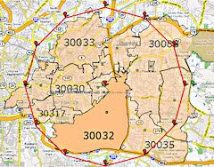
ZIP Code area within 3 miles

A mapping site called maps.huge.info can yield some useful data for your church. You can easily find the Postal ZIP codes within a specified radius of your church address, for example.

The radius search is a Google Maps mashup that uses a polygon to approximate a circle and displays ZIP Code area results graphically on the interactive map. You can drag the green radius indicator to change it or you can use the text box to change it.

The results also display brief demographics about the area selected. One example -- a couple of demographics for the ZIP codes found within a 3-mile radius of Avondale Pattillo UMC:

  • Year 2008 Households: 69,019 (est.)
  • Year 2000 Households: 62,142

The following postal areas were found within that 3-mile radius:

  • Avondale Estates
  • Clarkston
  • Decatur
  • Scottdale
  • Stone Mountain

"So what?", you say.

Let's be clear ... the more you know about the area around your church and the people who live there, the better you can serve your local community. Use the ZIP Code maps to consider where to "aim" mailouts or decide in which communities to seek to enter event (calendar type) information? Locate emailed newsletters or online calendars that serve the areas within your selected radius. Then contact the publication editor and find out how to get in their pub or on their calendar. This Google mashup can help you better target your external communications.

A 5-mile radius result

Trying to decide on a door-to-door evangelism-related effort? Use these maps to spark discussion on which local areas to go into.

Online ZIP Code mapping programs can also visually identify which parts of other ZIP Code areas are near you. Remember, different areas within a ZIP Code may have different demographics than the ZIP Code area as a whole.

Speaking of demographics, combine online demographic data for ZIP codes near your church with knowing what parts of which ZIP Codes are in the radius you wish to primarily serve.

Sunday, April 19, 2009

The state and future of Tweets

The Xconomy blog has an informative posting, Tweets from the Edge: The Ups and Downs of Twitter. It talks about current Twitter use and even a potential change to open source.

Some have described tweets as inane. Some see twitter users as people who are very egotistical. Some view most twitter users as addicts. Yet many are using the service. Is there a good use for Twitter by churches without the church becoming an egotistical addict? I say yes, but not necessarily as many use it now.

What I mostly see in Twitter is a series of daily mundane, inane comments that are kind of ridiculous to "follow". Nobody really cares when you'll be home, what baseball game you are watching, or why the Mets stink, let alone, be subjected to unfathomable tweets such as, "Dude!" as an answer to someone specific.

Wouldn't it be great if churches actually avoided bombarding people with mundane tweets and instead gave them less frequents ones that had some genuine religious content? Church webs, blogs, and Twitter accounts are not personal ones -- they need to reflect the spiritual life of that church. They need to have a deliberate spiritual slant. Christians are called to live "in" the world yet not to be "of" the world. Our online presence should reflect that.

None of this is to say that churches should not set up non-religious webs sites, blogs, or Twitter accounts with the aim to address a specific topic (baseball, computers, whatever). Those type sites need to be designed specifically for non-church people, with minimal reference to the church or a religion. Keep that type site separate from your "normal" church ones.

Churches could very productively use a church Twitter account to:

  • Remind members about important functions or meetings.
  • Advertise upcoming events.
  • Give a spiritual message (limited to 140 characters, of course).
  • Pass out urgent news (for example, news of a church closure due to impending bad weather).

Pastors and youth leaders could use Twitter to:

  • Reflect on an event that day (with spiritual overtones, not just mundane thoughts).
  • Pitch an upcoming church event.
  • Thank specific people for helping others (but avoid full names to protect privacy).
  • Give a short spiritual message.

This runs counter to current Twitter use, but to gain respectability, avoid irritating people, and give more meaning to church and church-related tweets:

  • Limit tweets to significant ones. No bursts of "I'm headed to the store" or "Hot Dawgs! Go Georgia!!"
  • Limit tweeting frequency. Start with a maximum of one per day unless urgent news needs to get out. If you are tweeting more than once per day, you are probably losing potential "followers".
  • Do a reality check. Ask yourself, "What religious or spiritual meaning does my Tweet have?" If the answer is, "None", seriously consider keeping silent. Tweeting too much on unimportant, non-religious topics by church leaders and organizations can viewed as "for the birds".

Thursday, March 19, 2009

Don't catch a "Social" disease

Social networking sites are quite popular these days. But the very nature of these sites makes them ripe for criminal activity. In order to protect both your own personal information and that of your family and friends, you'd need much tighter security and less information sharing than social networking demands.

Below are a few quotes that should make you shudder and "go very slow" if approached about your church setting up a page on a social networking service. Can you justify deliberately adding risk for your church's children and members as well as its visitors?
  • "With more than 150 million members worldwide and a huge amount of data on every user, [FaceBook] is a dream come true for spammers and identity thieves." (WindowsSecrets newsletter)
  • "[Facebook] site has been hit by five separate security problems in the last seven days, say security experts. ... Security firms warn that the popularity of social networking sites makes them a tempting target for hi-tech thieves." (BBC news)
  • "Get used to this [Koobface worm attack]. I think we'll see a steady stream of these kinds of stories with malware propagating via social networking contacts throughout the next few years. And, given the increasingly flexible APIs the social network sites are implementing, bad guys will be able to mine this information for attacks far more effectively." (SANS Security Newsletter)
  • "In an analysis of cyber crime activity in the 2nd half of 2007, security vendor Symantec Corp. found that two social networking sites [FaceBook and MySpace] together were the target of 91 percent of U.S.-based phishing Web sites." [And it will likely only get worse] (The Washington Post)
If you insist on taking personal risks with your own computer and identity and that of your family, at least consider the impact on your friends if they get infected, attacked, or scammed after visiting your web site or using the social network more extensively after visiting your site.

Churches place great emphasis on providing a "Safe Sanctuary" for children. But they leap onto FaceBook without any concern for their congregation or the visitors they hope will visit there. Taking some teens on a picnic lunch in a park is a great idea. But if that park is a known hangout for drug pushers, muggers, and rapists, we would never take them there.

Yet most churches ignore the very real (and increasing) criminal activity related to social networking sites because the sites are neat, modern, and popular. Churches need to do better at protecting our children, members, and web site visitors. Fun and fad should never trump the safety of our flock.

Maybe it's time for a "Safe Web" policy for churches. Does your church have such a policy? Does it enforce it?

The US-CERT governmental organization has issued some tips for people who just have to risk everything and have a social networking page/site. (See the US-CERT tips) These tips appear aimed at getting teenagers to be less naive about Internet use in general, but there are lots more steps that people should take. Why don't many take these steps? Because if they followed them, it would take some of the "fun" out of their (risky) surfing. Here are a few:
  • Never use your real name in your email address. Give away as little information about yourself as possible.
  • Use disposable email addresses when singing up at online stores or services (including social networking sites). If an address starts getting tons of Spam, you may be able to determine where it came from. You may even be able to alert a "friend" that their computer may be infected and that any email addresses on it may have been "harvested".
  • Whenever possible, do not give out your real name or other information that identifies you personally.
  • Do not identify other people by name, especially a full name, while online.
  • Always provide the minimum required information when signing up for a service or buying a product. Don't fill in every field on a form just because it's there.
  • Never "assume" that Jane Doe is really Jane Doe, even if "she" has a cute photo icon that is really her and she's using "her" email address. Anyone can copy images that appear on the web. And criminals steal email addresses all the time.
  • If you want to share photos, use a photo service such as Google Photos or Flickr. Don't use a social networking site for photos. That's just one more thing the criminals can steal.
  • Avoid associating personal information with online photos.
  • If you really must create a social networking page, tighten the security by customizing the configuration. The social networking site usually has info on how to do that. But the default for nearly all social networking sites is very "open" and not very secure.
  • Be paranoid. Be very, very paranoid. It's a good and righteous thing to be paranoid when the "bad guys" really are "out to get you"!

Tuesday, March 10, 2009

Is Twitter for churches?

Even Ellen Degeneres now tweets away on Twitter. Can anyone resist the urge to deluge the world with trivia about their mundane life? Who doesn't want to accumulate "followers".

Even that term makes me cringe. Should churches really want people who are "followers" of anyone other than Jesus? Are "followers" just the Greek chorus to the dreary drama of a dismal narcissist?

Jay Leno recently asked if those who use Twitter should be called "Twits". Are tweets for the birds? Is there a valid, spiritual use of Twitter? I think there is, but don't know that anyone is using it (more on this on a future post). Nearly all Twitter use I see is self-aggrandizing egotism. As a church member recently told me, "It's pretty arrogant to think that people really care about what you are doing or thinking all day" -- in 140 character or less bursts of "information".

Saturday, January 10, 2009

Friday, November 28, 2008

Picasa 3

Picasa 3 is fresh out of beta. Google says that key goals were a faster and more stable photo organizer/editor/sharing software.

If you use Picasa, update now. If you have not tried it, check out the new and improved features of Picasa 3. It's free software from Google.

Monday, October 27, 2008